
Most articles about photographer website design show you 16 gorgeous portfolios and tell you to get inspired. Inspiration is nice. It does not fill your calendar.
We build sites for creative businesses, and the pattern is always the same: photographers lose bookings not because their images are weak, but because the site around the images is doing nothing to move a visitor from “wow” to “what does this cost and can you shoot on the 14th?”
This guide breaks down the nine elements that actually convert, with layout advice for wedding, portrait and commercial niches. No mood boards. Just the structure that gets inquiries.
Why beautiful photography websites still fail to book clients
A visitor lands on your homepage from Instagram or a Google search. They give you roughly 5 to 8 seconds before deciding to stay or leave. In that window they are silently asking four questions:
- What kind of photographer is this?
- Do they shoot the thing I need, in my area?
- Roughly what does it cost?
- How do I contact them without feeling awkward?
A full screen slideshow with no text answers exactly zero of those. The most common conversion killers we find during audits:
- Homepage with 60 images and no words. Impressive, but the visitor has no idea if you shoot weddings, food or newborns.
- A single “Portfolio” page mixing every niche. A corporate marketing manager scrolling past a maternity session loses confidence fast.
- No prices anywhere. The visitor assumes you are out of budget, or worse, that you are hiding something.
- Slow galleries. Uncompressed 6 MB JPEGs on mobile data equals a bounce before the first image renders.
- A generic contact form. Name, email, message. It tells you nothing and it filters nobody.

The 9 elements of a photographer website that books
1. A hero section that positions you in three seconds
Your hero needs one strong image (or a short muted video loop) plus a headline that names the niche and the location. Not a poem. A sentence a stranger understands instantly.
- Weak: “Capturing moments that last forever.”
- Strong: “Wedding photographer in Montreal and across Quebec. Documentary style, half day and full day coverage from $2,400.”
Add one primary call to action (Check my availability) and one secondary (See pricing). Two buttons maximum. Every extra choice dilutes the click.
2. An image loading strategy, not just image compression
This is the single most neglected part of photography website design. Your site is 90% images by weight, so performance is a design decision, not a developer afterthought. Full details on https://onepagelove.com.
What a proper strategy looks like:
- Serve modern formats. AVIF with a WebP fallback typically cuts file size by 40 to 60% versus JPEG at the same perceived quality.
- Responsive sources. Use
srcsetandsizesso a phone never downloads a 2400px file. - Prioritize the hero. Preload the largest above the fold image and set
fetchpriority="high". Lazy load everything below the fold. - Reserve space. Always declare width and height so galleries do not jump while loading.
- Progressive galleries. Load 12 to 18 thumbnails, then load more on scroll or with a “view more” button. Full resolution only opens in the lightbox.
- Use a CDN with on the fly resizing so you upload once and the platform serves the right size.
Practical targets we use on client builds:
| Placement | Max width | Format | Target file size |
|---|---|---|---|
| Desktop hero | 2400 px | AVIF / WebP | Under 250 KB |
| Mobile hero | 900 px | AVIF / WebP | Under 120 KB |
| Gallery thumbnail | 800 px | WebP | 80 to 120 KB |
| Lightbox / full view | 1600 to 2000 px | WebP | Under 300 KB |
| Blog / story post | 1400 px | WebP | Under 200 KB |
Aim for a Largest Contentful Paint under 2.5 seconds on 4G and an Interaction to Next Paint under 200 ms. If your homepage weighs 15 MB, no amount of styling will save the conversion rate.
3. Curated galleries instead of archives
Clients do not judge you on your best photo. They judge you on your average photo. Twenty five outstanding frames beat 200 good ones.
- Cap each gallery at 25 to 40 images.
- Order them like a story: establishing shot, details, people, emotional peak, closing frame.
- Show 2 or 3 complete sessions or weddings in full rather than a highlight reel of 40 different jobs. Buyers want proof of consistency across an entire deliverable.
- Keep the grid quiet. Thin gutters, no heavy shadows, no hover animations that fight the image.
4. One page per service, not one giant portfolio
Service pages are the workhorses of a photography site. They rank in Google, they answer objections, and they give you somewhere specific to send ad traffic. Related reading: Best Photography Website Builder: Tested by a Photographer.
Each service page should include:
- An H1 that matches how people search (“Corporate headshot photography in Toronto”)
- A short paragraph on who it is for
- A focused gallery of that service only
- What is included and how the session runs, step by step
- Starting price and turnaround time
- Two or three testimonials from that exact type of client
- A clear inquiry CTA at the top and bottom
A photographer with wedding, engagement, elopement and family pages will out-rank a single “Portfolio” link every single time.
5. Pricing transparency (even if you hate the idea)
You do not have to publish your full price list. You do have to give a signal. “Contact for pricing” is the fastest way to lose the qualified buyer and keep the tire kicker, because serious clients with a budget will simply go to a competitor who is upfront.
Three options that work, in order of effectiveness:
| Approach | Best for | Effect on inquiries |
|---|---|---|
| Full package table with prices | Portraits, headshots, mini sessions, real estate | Fewer inquiries, much higher close rate |
| “Collections start at $X” plus average spend | Weddings, events | Good balance, filters out low budgets |
| Price ranges by scope + custom quote form | Commercial, brand, product | Keeps flexibility, still sets expectations |
If you truly cannot publish numbers, publish a budget range in the inquiry form instead. The visitor self-selects, and you stop writing quotes for people who were never going to book.
6. An inquiry form designed to qualify, not just collect
The form is your checkout page. Treat it with the same care an ecommerce store treats a cart.
Fields worth including:
- Name, email, phone (phone optional to reduce friction)
- Type of session or service (dropdown)
- Date or approximate timeframe (date picker)
- Location or venue
- Budget range (radio buttons, not an open field)
- “Tell me about your project” free text
- How did you hear about me (gold for your marketing data)
Rules that lift completion rates:
- Keep it to 7 fields or fewer on mobile, or split into two short steps.
- Show a friendly promise near the button: “I reply to every inquiry within 24 hours, Monday to Friday.”
- Replace the generic “Submit” with “Check my date” or “Request a quote”.
- Send an instant, well written auto-reply that includes your pricing guide PDF and your typical process. Speed of first response correlates directly with booking rate.
- Redirect to a real thank you page so you can track the conversion properly.
7. Proof that is specific, not decorative
Five star icons with no name attached persuade nobody. Strong proof looks like:
- A testimonial with full name, city and the type of session, ideally next to a photo from that shoot
- Logos of brands, venues or publications you have worked with (commercial and wedding shooters especially)
- A number that is easy to grasp: “180 weddings documented since 2016”
- Google reviews embedded on the contact and pricing pages, where doubt peaks
8. An about page that shows your face and your process
The about page is often the second most visited page on a photography site, right after the homepage. People are hiring a human who will be in their personal space for hours.
Include a clear portrait of yourself, three or four sentences on how you work, what a session feels like, your gear only if clients care (commercial buyers do, wedding couples rarely), and a CTA at the bottom. Never leave the about page as a dead end.
9. A visible booking path on every screen
Assume the visitor decides at a random point in the scroll. Give them somewhere to go from anywhere:
- A sticky header with a contrasting Book or Inquire button
- A sticky bottom bar on mobile with tap-to-call and inquire
- A CTA block after every gallery and at the end of every blog post
- Optional calendar embed for services that can be self-booked, such as headshots or mini sessions

Layout advice per niche
The same nine elements apply everywhere, but the emphasis shifts a lot depending on who is buying.
Wedding photography websites
Buyers are emotional, compare 5 to 10 photographers, and care enormously about date availability and personality.
- Lead with full wedding stories, not single hero frames. Two or three complete galleries with short written narratives.
- Put date availability front and center. “Check your date” outperforms “Contact” consistently.
- Publish an “Investment” page with starting price, what a full day includes, album options and travel policy.
- Add a real FAQ: backup gear, second shooter, delivery timeline, rain plan, deposit and cancellation terms.
- Blog individual weddings by venue name. Those posts rank locally and bring in couples searching for their venue.
Portrait, family and headshot websites
Buyers are practical, decide faster, and hate uncertainty about what happens during a session.
- Publish full package pricing in a simple table. This niche rewards transparency more than any other.
- Explain the process in 4 steps: book, prepare, shoot, receive your gallery.
- Add a “What to wear” guide. It is a great SEO asset and reduces pre-session anxiety.
- Consider online self-booking with deposit for mini sessions and headshots.
- Show before and after or studio setup shots to demystify the experience.
Commercial, brand and product photography websites
Buyers are marketing managers, agency producers and business owners. They evaluate reliability as much as aesthetics.
- Organize the portfolio by industry or deliverable (food and beverage, hospitality, ecommerce packshots, corporate lifestyle) rather than chronologically.
- Use short case studies: client, brief, what was delivered, how it was used, result if you have one.
- State licensing and usage terms in plain language, plus day rate ranges or project minimums.
- Mention crew capability, studio access, retouching workflow and turnaround times.
- Keep the design restrained. In commercial work the client’s product is the star, and the site should feel like a reliable supplier, not an art project.

SEO essentials for photography sites
Pretty sites that nobody finds are hobbies. A few non-negotiables:
- Location in your titles. “Wedding photographer in Bordeaux” beats “Home | Studio Lumen”.
- Descriptive file names and alt text. Not DSC_4471.jpg. Use something like elopement-mont-tremblant-ceremony.jpg with alt text that describes the scene for real humans.
- A page per service and per key city you actually serve.
- Structured data: LocalBusiness or ProfessionalService, plus Review and FAQPage where relevant.
- Google Business Profile connected, with your service pages linked and reviews flowing in.
- Blog with intent: venue guides, “how much does X cost” posts, session previews. These bring searchers who are already close to booking.
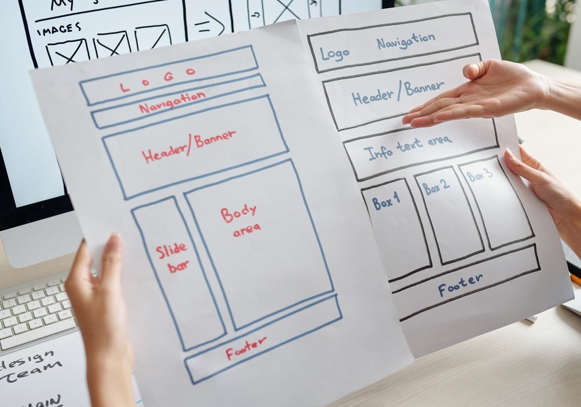
Platform choice: what actually matters
Squarespace, WordPress, Pixieset, Showit, Format, Webflow. They can all produce a good result. Judge them on this instead of templates:
| Criterion | Why it matters |
|---|---|
| Automatic responsive images and modern formats | Directly controls load speed and mobile bounce rate |
| Full control over page titles, meta, URLs, schema | Required to rank for local searches |
| Flexible forms with conditional logic | Lets you qualify leads properly |
| Integration with your CRM and client galleries | Saves hours per booking and speeds up replies |
| Ability to add unlimited service and location pages | Your main organic growth lever |
| Ownership and export of your content | Protects you if you migrate later |
A drag and drop builder with a heavy template can easily be slower than a well built custom site. Test the demo on your phone, on mobile data, before you commit. For the wider picture, see Free online photography website maker.

Quick conversion audit: 12 point checklist
- Does my homepage state my niche and location above the fold?
- Is there a visible CTA without scrolling, on mobile too?
- Does the homepage load in under 2.5 seconds on 4G?
- Is every image served in WebP or AVIF at the right size?
- Do I have a separate page for each service I sell?
- Is a price or price range visible somewhere within two clicks?
- Does my inquiry form capture date, service type and budget?
- Do I reply automatically within seconds and personally within 24 hours?
- Are there at least six named testimonials spread across the site?
- Is my face on the site with a short, human bio?
- Are conversions tracked in analytics with a thank you page?
- Does every gallery and blog post end with a next step?
Score under 8 out of 12 and your site is leaking bookings that your photography already earned.
FAQ
How much does a photographer website design cost?
A well configured template-based site typically runs from a few hundred to around $2,500 depending on content volume and setup. A custom designed site with strategy, copywriting, service pages, performance optimization and SEO foundations generally sits between $3,000 and $10,000. The deciding factor is not the design itself but how much content and conversion work is included.
Should I show my prices on my photography website?
Yes, at minimum a starting price. It filters out unqualified inquiries, builds trust, and matches how people search (“wedding photographer prices”). If your pricing is genuinely project based, publish ranges and use a budget selector in your inquiry form.
How many photos should be on my portfolio?
Around 25 to 40 images per gallery, and 2 or 3 full sessions or weddings shown end to end. Consistency convinces more than volume, and fewer images load faster.
Do photographers still need a website with Instagram?
Yes. Social platforms are discovery channels, not booking channels. Your site is where pricing, availability, proof and the inquiry form live, and it is the only asset you own and can rank in Google.
What is the best page structure for a photography site?
Home, one page per service, Portfolio or galleries by category, About, Pricing or Investment, Reviews, Blog, Contact, plus location pages if you serve several cities. Keep the main navigation to six items or fewer.
How do I make my photography site load faster?
Resize and convert every image to AVIF or WebP, use responsive srcset, lazy load below the fold content, preload the hero, limit fonts and scripts, and serve everything through a CDN. Images are almost always the culprit, not the theme.
Ready to turn your portfolio into a booking machine?
At Branded Web Design we build photography websites around one goal: qualified inquiries in your inbox. Fast galleries, clear service pages, honest pricing structure and forms that filter before you ever pick up the phone. Get in touch for a free conversion audit of your current site.