Your about page is the second most visited page on most websites, right after the homepage. Yet most businesses treat it like a digital resume: a wall of text, a stock photo, and a generic mission statement. That is a missed opportunity.
Visitors who land on your about page are actively evaluating you. They want to know if they can trust you, if you understand their problem, and if you are the right fit. A well-built about page design does not just tell your story, it removes doubt and pushes prospects toward a decision.
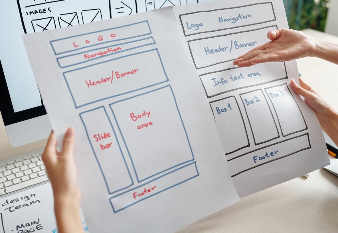
Below are the 8 elements we use at Branded Web Design when we build about pages that actually generate leads.
Why Most About Pages Fail to Convert
Before we get into what works, let’s name what doesn’t. Most about pages fail for three reasons:
- They are written for the founder’s ego, not the visitor’s questions
- They use vague language like “passionate”, “innovative”, or “world-class” without proof
- They have no clear next step, so curious visitors bounce
The fix is to treat the about page like a landing page with a personality. Every section should answer a question the visitor already has in their head.

The 8 Elements of a High-Converting About Page
1. A Headline That Speaks to the Visitor, Not About You
The biggest mistake we see: headlines like “About Us” or “Our Story”. Functional, but wasted real estate. Your headline should immediately tell the visitor what you do and who you help.
Weak examples:
- “About Our Agency”
- “Welcome to [Company Name]”
- “Our Story”
Strong examples:
- “We help SaaS founders turn messy onboarding into revenue”
- “Branding for service businesses that are tired of looking like everyone else”
- “15 years building websites that don’t just look good, they sell”
The pattern: outcome + audience + a hint of personality.
2. A Real Photo of Real People
Trust collapses the moment a visitor sees a stock photo of strangers shaking hands. Use real photography of you, your team, your office, or your work in progress.
| Photo Type | Trust Impact | Best Used For |
|---|---|---|
| Stock photography | Low | Avoid on about pages |
| Professional headshots | Medium | Team grid section |
| Candid team shots | High | Hero or story section |
| Behind-the-scenes work | Very High | Process explanation |
If you cannot afford a full photoshoot, even an honest smartphone photo beats stock imagery.
3. A Story With Conflict, Not a Timeline
Founders love to write “Founded in 2018, we have grown to serve clients in 12 countries”. Visitors do not care about your timeline. They care about why you exist.
Use this 4-part structure instead:
- The problem you noticed in the market or in your own life
- The frustration with existing solutions
- The shift when you realized there was a better way
- The mission you are on now
This structure works because it mirrors the visitor’s own frustration. When they read your story, they think “that’s exactly what I’m dealing with”.
4. Social Proof Placed Above the Fold
Do not save testimonials for the bottom of the page. Place at least one strong proof element within the first scroll. Options that work:
- Client logos (especially recognizable ones)
- A single, specific testimonial with a real photo and full name
- A concrete metric: “Trusted by 240+ Shopify brands”
- Press mentions or awards
Specificity beats volume. One testimonial that says “They rebuilt our checkout and our conversion rate jumped 34% in two weeks” is worth more than ten generic five-star reviews.
5. Values That Show, Don’t Tell
If your values section says “Integrity, Innovation, Excellence”, delete it. Those words mean nothing because every competitor says the same thing.
Instead, write values as behaviors:
- Not “transparency” but “We send a weekly Loom video so you always know where the project stands”
- Not “quality” but “Every deliverable is reviewed by two senior designers before it reaches you”
- Not “partnership” but “We turn down projects we don’t believe we can win for you”
6. A Team Section That Feels Human
If you have a team, show them. If you are a solo founder, own it. Either way, add personality to the bios. A two-line bio that mentions someone is a competitive chess player or a former teacher creates more connection than a list of credentials.
Bio template that works:
- Name and role
- One sentence on what they do for clients
- One sentence of personality (a hobby, a quirk, a strong opinion)
7. Process or Approach Snapshot
Visitors on your about page are often weighing whether working with you will be smooth or chaotic. A short process overview removes that anxiety. Three to five steps with short descriptions is enough. No need to give away the full playbook, just show that you have one.
8. A Clear, Specific Call to Action
End the page with a conversion moment. Not “Contact us”. Be specific about what happens next.
Generic CTAs to avoid:
- “Get in touch”
- “Learn more”
- “Contact us today”
CTAs that convert:
- “Book a 20-minute strategy call”
- “Get a free website audit within 48 hours”
- “See if we are a fit (4 quick questions)”
Pair the CTA with one final piece of social proof or a reassurance line like “No sales pitch, just useful feedback”.

About Page Layout: How to Order These Elements
Element order matters as much as the elements themselves. Here is the structure we recommend for most service businesses:
- Outcome-focused headline + supporting subheadline
- Hero image (real, not stock)
- Quick social proof bar (logos or one testimonial)
- The story (problem, frustration, shift, mission)
- Values as behaviors
- Process snapshot
- Team section
- Deeper social proof (case studies, testimonials)
- Specific CTA

Common About Page Design Mistakes to Avoid
- Too much text, not enough rhythm. Break copy with images, pull quotes, and white space
- Mission statements written for investors. Write for your buyer, not your board
- No mobile thought. Over 60% of about page traffic is mobile. Test it
- Hiding contact options. Make it stupid simple to reach you
- Outdated team photos or copy. A 2021 “latest news” section is a trust killer
FAQ: About Page Design
How long should an about page be?
Long enough to cover the 8 elements above, short enough that every section earns its place. For most service businesses, that lands between 600 and 1,200 words of copy, broken up with visuals.
Should I write “About Us” or “About Me”?
If you are a solo operator, use “About” or skip the label entirely and lead with your headline. “About Us” when you are one person reads as inauthentic.
Do I need professional photography for my about page?
It helps, but it is not mandatory. A clean, well-lit smartphone photo of the real you beats a polished stock image every single time. Invest in proper photography once your conversion rate justifies it.
Where should the call to action go on an about page?
Place a primary CTA at the bottom of the page and a secondary CTA in the navigation or as a sticky element. Some high-performing about pages also include a soft CTA mid-page after the story section.
Can my about page replace a sales page?
No, but it should warm up visitors enough that they want to visit your services or contact page. Think of the about page as the bridge between curiosity and commitment.
Final Thought
A good about page design is not about telling your story. It is about making the visitor feel understood, then giving them a clear, low-friction way to take the next step. Audit your current about page against these 8 elements. If three or more are missing, you are leaving leads on the table.
Need help rebuilding yours? That’s what we do every day at Branded Web Design. Reach out and we will tell you exactly what to fix first.